1. Introduction
This section is not normative.
CSS Multicol 1 § 4 Column Gaps and Rules allows for rules to be drawn between columns in a multicol container. This specification expands upon the column-rule-width, column-rule-style, and column-rule-color properties, adding equivalents in the row direction, expanding their application to other container layouts, and giving advanced control over where and how gap decorations are painted.
1.1. Value Definitions
This specification follows the CSS property definition conventions from [CSS2] using the value definition syntax from [CSS-VALUES-3]. Value types not defined in this specification are defined in CSS Values & Units [CSS-VALUES-3]. Combination with other CSS modules may expand the definitions of these value types.
In addition to the property-specific values listed in their definitions, all properties defined in this specification also accept the CSS-wide keywords as their property value. For readability they have not been repeated explicitly.
2. Gap decorations
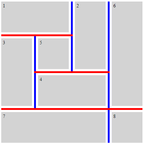
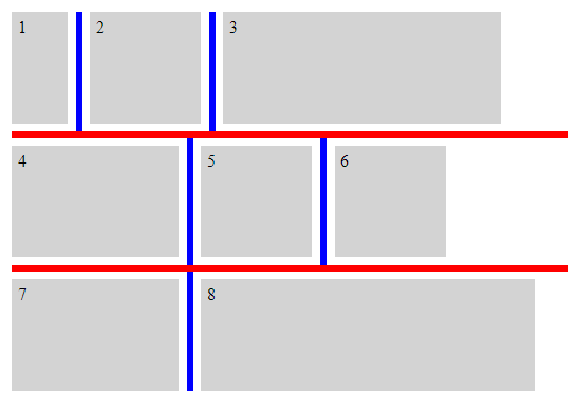
Various layouts in CSS such as multicol containers, flex containers, grid containers, and masonry containers position child boxes adjacent to each other with gaps, also known as gutters, between them. Each such gap may contain a gap decoration, which is a visible separator (such as a line) painted between adjacent boxes.
.grid-with-spans {
  display: grid;
  grid-template: repeat(4, 100px) / repeat(4, 100px);
  gap: 20px;
  row-rule: 6px solid red;
  column-rule: 6px solid blue;
}
.flex {
  display: flex;
  flex-wrap: wrap;
  gap: 20px;
  width: 500px;
  row-rule: 6px solid red;
  column-rule: 6px solid blue;
}
2.1. Layout and painting
This specification does not generally define the geometry of gaps in container layouts; that is left to other specifications. See CSS Box Alignment 3 § 8 Gaps Between Boxes for definitions pertaining to multicol containers, flex containers, and grid containers.
Gap decorations do not take up space. That is, the presence or width of a gap decoration will not alter the placement of anything else. If a gap decoration is wider than its gap, any adjacent boxes will overlap the decoration, and in some cases the decoration may extend outside the box of the container. Gap decorations are painted just above the border of the container. For scrollable containers, note that while the border and background of the container aren’t scrolled, the decorations need to scroll along with items in the container.
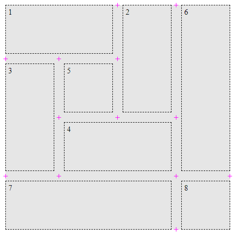
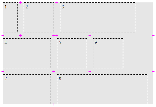
A gap intersection point is defined to exist in each of the following locations:
- The center of an intersection between a gap and the content edge of the container.
- The center of an intersection between gaps in different directions.
The following examples illustrate the locations of gap intersection points, marked with a magenta + in each case.
.grid {
  display: grid;
  grid-template: repeat(4, 100px) / repeat(4, 100px);
  gap: 20px;
  background: rgb(255 255 128);
}
.grid > * {
  border: 1px dashed black;
}
.flex {
  display: flex;
  flex-wrap: wrap;
  gap: 20px;
  width: 500px;
  background: rgb(255 255 128);
}
.flex > * {
  border: 1px dashed black;
}
Gap decorations are painted relative to pairs of gap intersection points, in the center of the corresponding gap and parallel to its edges.
2.2. Breaking gap decorations into segments: The column-rule-break, row-rule-break, and gap-rule-break properties
| Name: | column-rule-break, row-rule-break |
|---|---|
| Value: | intersection | spanning-item | none |
| Initial: | spanning-item |
| Applies to: | grid containers, flex containers, multicol containers, and masonry containers |
| Inherited: | no |
| Percentages: | n/a |
| Computed value: | as specified |
| Canonical order: | per grammar |
| Animation type: | discrete |
Sets the behavior for breaking decorations within a given gap into segments.
- intersection
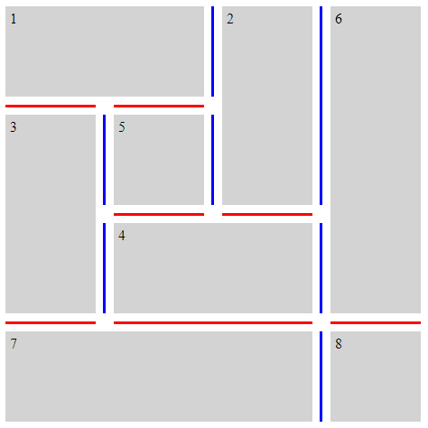
- Gap decorations start and end at every gap intersection point along the centerline of the gap.
- spanning-item
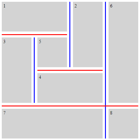
- Gap decorations start and end at every gap intersection point along the centerline of the gap which is either at an edge of the container or adjacent to a child item spanning across the gap per the steps below.
- none
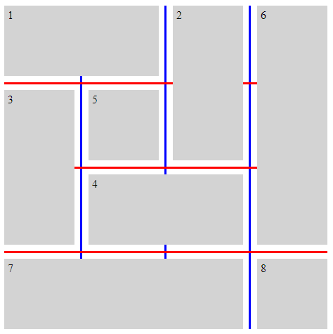
- Gap decorations start and end at gap intersection points which are at an edge of the container only.
| Name: | gap-rule-break |
|---|---|
| Value: | <'column-rule-break'> |
| Initial: | see individual properties |
| Applies to: | Same as column-rule-break and row-rule-break |
| Inherited: | see individual properties |
| Percentages: | see individual properties |
| Computed value: | see individual properties |
| Animation type: | see individual properties |
| Canonical order: | per grammar |
Sets the column-rule-break and row-rule-break properties to the same value.
To determine pairs of gap decoration endpoints within a given gap:
- Let pairs be an empty list. Let endpoints be the list of gap intersection points that fall along the centerline of gap, ordered from start to end along gap’s axis. Let break be the used value of either column-rule-break or row-rule-break, whichever applies to gap.
- If endpoints contains fewer than 2 items, return pairs.
- Remove the first item from endpoints. Let start be equal to that item.
- Remove the first item from endpoints. Let end be equal to that item.
-
If endpoints is non-empty, and either of the following conditions is true...
- break is spanning-item, and a line segment from start to the first item in endpoints, with the same width as gap, does not intersect a child item in the container
- break is none
Note: The test when break is spanning-item is intended to address cases such as the one below:
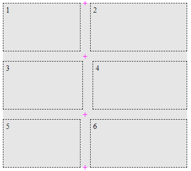
The four marked gap intersection points fall along a common gap centerline. However, because item 3 is slightly wider than items 1 and 5, the spanning-item test returns false when start is the topmost point and the first point in endpoints is the third point from the top. Thus, the two upper gap intersection points form a pair, and the two lower gap intersection points form a pair. (There is an additional pair of gap intersection points, slightly offset to the right of the two middle points, which are not marked. These points will form another pair.) - Compute the offset for start within gap. Offset start by the result, in the forward direction along gap’s axis.
- Compute the offset for end within gap. Offset end by the result, in the reverse direction along gap’s axis.
- Add to pairs a tuple consisting of start and end.
- Go back to step 2.
A gap decoration is painted between each pair of endpoints identified using the steps above.
The following examples illustrate various settings for the *-rule-break properties. To make the differences more apparent, the *-rule-outset properties are set to 0.
.break-intersection {
  gap-rule-break: intersection;
  grap-rule-outset: 0px;
}
.break-spanning-item {
  gap-rule-break: spanning-item;
  grap-rule-outset: 0px;
}
.break-none {
  gap-rule-break: none;
  grap-rule-outset: 0px;
}
2.3. Adjusting gap decoration endpoints: The column-rule-outset, row-rule-outset, and gap-rule-outset properties
| Name: | column-rule-outset, row-rule-outset |
|---|---|
| Value: | <length-percentage> |
| Initial: | 50% |
| Applies to: | grid containers, flex containers, multicol containers, and masonry containers |
| Inherited: | no |
| Percentages: | refer to the crossing gap width |
| Computed value: | as specified |
| Canonical order: | per grammar |
| Animation type: | by computed value type |
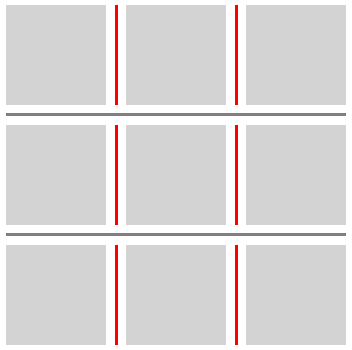
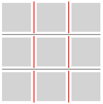
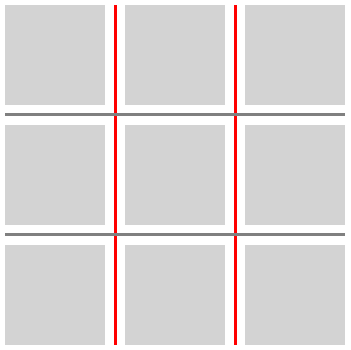
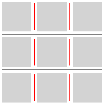
These properties can be used to offset the endpoints of gap decorations relative to the gap intersection points which would normally determine their endpoints. The initial value of 50% places the gap decoration endpoint in the center of the intersection. With a value of 0, the gap decoration endpoint will coincide with the edge of the intersection. Positive values extend towards the center of the intersection; negative values recede from it. These offsets also apply at the edges of the container, where positive values may extend beyond the content bounds of the container.
| Name: | gap-rule-outset |
|---|---|
| Value: | <'column-rule-outset'> |
| Initial: | see individual properties |
| Applies to: | Same as column-rule-outset and row-rule-outset |
| Inherited: | see individual properties |
| Percentages: | see individual properties |
| Computed value: | see individual properties |
| Animation type: | see individual properties |
| Canonical order: | per grammar |
Sets the column-rule-outset and row-rule-outset properties to the same value.
.outset-0px {
  column-rule-outset: 0px;
}
.outset-5px {
  column-rule-outset: 5px;
}
.outset-50percent {
  column-rule-outset: 50%;
}
.outset-negative-5px {
  column-rule-outset: -5px;
}
When considering the gap intersection points within a given gap, each point is assigned a crossing gap width, defined as follows:
- At the content edge of the container
- The crossing gap width is 0.
- At an intersection with another gap
- The crossing gap width is the used value of the column-gap or row-gap property, whichever applies to the intersecting gap.
To compute the offset for a given gap intersection point point within a given gap:
- Let width be the crossing gap width for point.
- Let outset be the computed value of either column-rule-outset or row-rule-outset, whichever applies to gap. Resolve any percentages in outset against width.
- Let result be width multiplied by 50%. Subtract outset from result.
- Return result.
For details on how the offset is applied, see the steps to determine pairs of gap decoration endpoints.
2.4. Gap decoration paint order: The gap-rule-paint-order property
| Name: | gap-rule-paint-order |
|---|---|
| Value: | row-over-column | column-over-row |
| Initial: | row-over-column |
| Applies to: | grid containers, flex containers, and masonry containers |
| Inherited: | no |
| Percentages: | n/a |
| Computed value: | as specified |
| Canonical order: | per grammar |
| Animation type: | discrete |
Sets the paint order for gap decorations in two-dimensional containers.
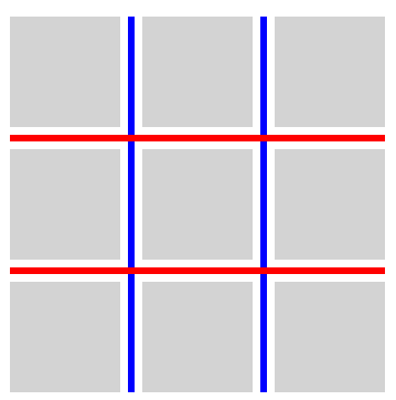
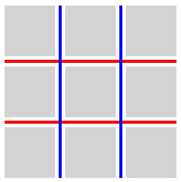
The following examples illustrate adjustment of gap decoration paint order using the gap-rule-paint-order property.
.row-over-coulumn {
  gap-rule-paint-order: row-over-column;
  row-rule: 6px solid red;
  column-rule: 6px solid blue;
}
gap-rule-paint-order: column-over-row;
row-rule: 6px solid red;
column-rule: 6px solid blue;
3. Color, style, and width
Property definitions in this section supersede the definitions of properties with the same names in [CSS-MULTICOL-1].
3.1. Gap decoration color: The column-rule-color and row-rule-color properties
| Name: | column-rule-color, row-rule-color |
|---|---|
| Value: | <line-color-list> | <auto-line-color-list> |
| Initial: | curerentcolor |
| Applies to: | grid containers, flex containers, multicol containers, and masonry containers |
| Inherited: | no |
| Percentages: | n/a |
| Computed value: | as specified |
| Canonical order: | per grammar |
| Animation type: | by computed value type |
<line-color-list>          = [ <line-color-or-repeat> ]+

<auto-line-color-list>     = [ <line-color-or-repeat> ]*
                             <auto-repeat-line-color>
                             [ <line-color-or-repeat> ]*

<line-color-or-repeat>     = [ <color> | <repeat-line-color> ]

<repeat-line-color>        = repeat( [ <integer [1,∞]> ] , [ <color> ]+ )

<auto-repeat-line-color>   = repeat( auto , [ <color> ]+ )
- <color>
- Sets the color of gap decorations.
3.2. Gap decoration style: The column-rule-style and row-rule-style properties
| Name: | column-rule-style, row-rule-style |
|---|---|
| Value: | <line-style-list> | <auto-line-style-list> |
| Initial: | none |
| Applies to: | grid containers, flex containers, multicol containers, and masonry containers |
| Inherited: | no |
| Percentages: | n/a |
| Computed value: | as specified |
| Canonical order: | per grammar |
| Animation type: | discrete |
<line-style-list>          = [ <line-style-or-repeat> ]+

<auto-line-style-list>     = [ <line-style-or-repeat> ]*
                             <auto-repeat-line-style>
                             [ <line-style-or-repeat> ]*

<line-style-or-repeat>     = [ <line-style> | <repeat-line-style> ]

<repeat-line-style>        = repeat( [ <integer [1,∞]> ] , [ <line-style> ]+ )

<auto-repeat-line-style>   = repeat( auto , [ <line-style> ]+ )
These properties set the styles of gap decorations. The <line-style> values are interpreted as in the collapsing border model.
3.3. Gap decoration width: The column-rule-width and row-rule-width properties
| Name: | column-rule-width, row-rule-width |
|---|---|
| Value: | <line-width-list> | <auto-line-width-list> |
| Initial: | medium |
| Applies to: | grid containers, flex containers, multicol containers, and masonry containers |
| Inherited: | no |
| Percentages: | n/a |
| Computed value: | list of absolute lengths, snapped as a border width, or 0 under conditions described below |
| Canonical order: | per grammar |
| Animation type: | by computed value type |
<line-width-list>          = [ <line-width-or-repeat> ]+

<auto-line-width-list>     = [ <line-width-or-repeat> ]*
                             <auto-repeat-line-width>
                             [ <line-width-or-repeat> ]*

<line-width-or-repeat>     = [ <line-width> | <repeat-line-width> ]

<repeat-line-width>        = repeat( [ <integer [1,∞]> ] , [ <line-width> ]+ )

<auto-repeat-line-width>   = repeat( auto , [ <line-width> ]+ )
This property sets the widths of gap decorations. Negative values are not allowed.
If the computed value of column-rule-style is none or , then the computed value of column-rule-width is 0. This behavior is for backwards compatibility with CSS Multicol 1 § 4.4 The Width Of Column Rules: the column-rule-width property.
Should we extend the "force to 0" behavior to the row properties?
Should the "force to 0" behavior apply when lists of values are involved? If so, how should this be handled with unaligned lists?
3.4. Lists of values and the repeat() notation
Each of the properties in this section accepts a space-separated list of values. Setting multiple values in this way allows for varying gap decorations within a given container.
column-rule-width: 1px;
column-rule-style: solid;
column-rule-color: red blue;
Such a list may contain repeat() notations. Similar to CSS Grid Layout 1 § 7.2.3 Repeating Rows and Columns: the repeat() notation, these notations allow a series of gap decorations that exhibit a recurring pattern to be written in a more compact form.
The generic form of the repeat() syntax is, approximately,
repeat( [ <integer [1,∞]> | auto ] , <value>+ )
The first argument to repeat() specifies the number of repetitions.
- <integer>
- Specifies an integer repeater. An integer repeater expands out to the list of values in the second argument, repeated as many times as specified by the first argument.
- auto
-
Specfies an auto repeater.
An auto repeater will be used to fill in values for gaps
that would not otherwise receive values from other parts of the list.
At most one repeat() in a given list of values may be an auto repeater.
Continuing from the previous example, if the author does not know how many columns will be in the final layout, they might instead write:
column-rule-color: gray repeat(auto, red blue) gray;
Which will produce a gray decoration in the first and last column gaps, and alternating red and blue decorations in the in-between column gaps.
The second argument to repeat() is a space-separated list of values that would be accepted by the property in which the repeat() appears.
To assign gap decoration values to a list of gaps using a list of values:
- Replace any integer repeaters in values with their expanded-out equivalents.
- If the list contains no auto repeater, then:
- Beginning from the first item in values and the first item in gaps, assign each value to the corresponding gap. If there are fewer values than gaps, repeat beginning from the first item in values, as many times as needed.
- End this algorithm.
- values contains an auto repeater. Let leading count be the number of items in values before the auto repeater. Let trailing count be the number of items in values after the auto repeater.
-
Partition gaps as follows:
- Let leading gaps contain the first leading count items in gaps.
- Let trailing gaps contain the last trailing count items in gaps, excluding any items in leading gaps.
- Let auto gaps contain any items in gaps that are not in either leading gaps or trailing gaps.
- If leading gaps is non-empty, assign gap decoration values to leading gaps using the first leading count items in values.
- If trailing gaps is non-empty, assign gap decoration values in reverse to trailing gaps using the last trailing count items in values.
- If auto gaps is non-empty, assign gap decoration values to auto gaps using the list of values in the second argument of the auto repeater.
To assign gap decoration values in reverse to a list of gaps using a list of values, follow the same steps as to assign gap decoration values, except that in step 2, change all instances of "first" to "last".
Discuss the handling of auto repeater resolution in cases where the number of gaps is less than the number of values.
3.5. Gap decoration shorthands: The column-rule and row-rule properties
| Name: | column-rule, row-rule |
|---|---|
| Value: | <gap-rule-list> | <auto-gap-rule-list> |
| Initial: | see individual properties |
| Applies to: | see individual properties |
| Inherited: | see individual properties |
| Percentages: | see individual properties |
| Computed value: | see individual properties |
| Animation type: | see individual properties |
| Canonical order: | per grammar |
<gap-rule-list>        = <gap-rule-or-repeat> [ / <gap-rule-or-repeat> ]*

<auto-gap-rule-list>   = [ [ <gap-rule-or-repeat> ] / ]*
                         <auto-repeat-gap-rule>
                         [ / [ <gap-rule-or-repeat> ] ]*

<gap-rule-or-repeat>   = [ <gap-rule> | <repeat-gap-rule> ]

<repeat-gap-rule>      = repeat( [ <integer [1,∞]> ] , [ <gap-rule> ]# )

<auto-repeat-gap-rule> = repeat( auto , [ <gap-rule> ]# )

<gap-rule>             = [ <line-width> || <line-style> || <color> ]
These shorthands set the corresponding width, style, and color properties as a set.
Are the slashes to separate values into tuples the right way to structure this? Or would it be safe to allow free-form mixing, for example 'column-rule: 1px 5px solid black'? Note that commas are reserved for future extension of the grammar to support gap decoration areas.
3.6. Bi-directional gap decoration shorthands: The gap-rule-color, gap-rule-style, gap-rule-width, and gap-rule properties
| Name: | gap-rule-color |
|---|---|
| Value: | <'column-rule-color'> |
| Initial: | see individual properties |
| Applies to: | Same as column-rule-color and row-rule-color |
| Inherited: | no |
| Percentages: | see individual properties |
| Computed value: | see individual properties |
| Animation type: | see individual properties |
| Canonical order: | per grammar |
| Name: | gap-rule-style |
|---|---|
| Value: | <'column-rule-style'> |
| Initial: | see individual properties |
| Applies to: | Same as column-rule-style and row-rule-style |
| Inherited: | no |
| Percentages: | see individual properties |
| Computed value: | see individual properties |
| Animation type: | see individual properties |
| Canonical order: | per grammar |
| Name: | gap-rule-width |
|---|---|
| Value: | <'column-rule-width'> |
| Initial: | see individual properties |
| Applies to: | Same as column-rule-width and row-rule-width |
| Inherited: | no |
| Percentages: | see individual properties |
| Computed value: | see individual properties |
| Animation type: | see individual properties |
| Canonical order: | per grammar |
| Name: | gap-rule |
|---|---|
| Value: | <'column-rule'> |
| Initial: | see individual properties |
| Applies to: | Same as column-rule and row-rule |
| Inherited: | no |
| Percentages: | see individual properties |
| Computed value: | see individual properties |
| Animation type: | see individual properties |
| Canonical order: | per grammar |
These shorthands set the corresponding column and row properties to the same values.
Privacy Considerations
No new privacy considerations have been reported on this specification.
Security Considerations
No new security considerations have been reported on this specification.